
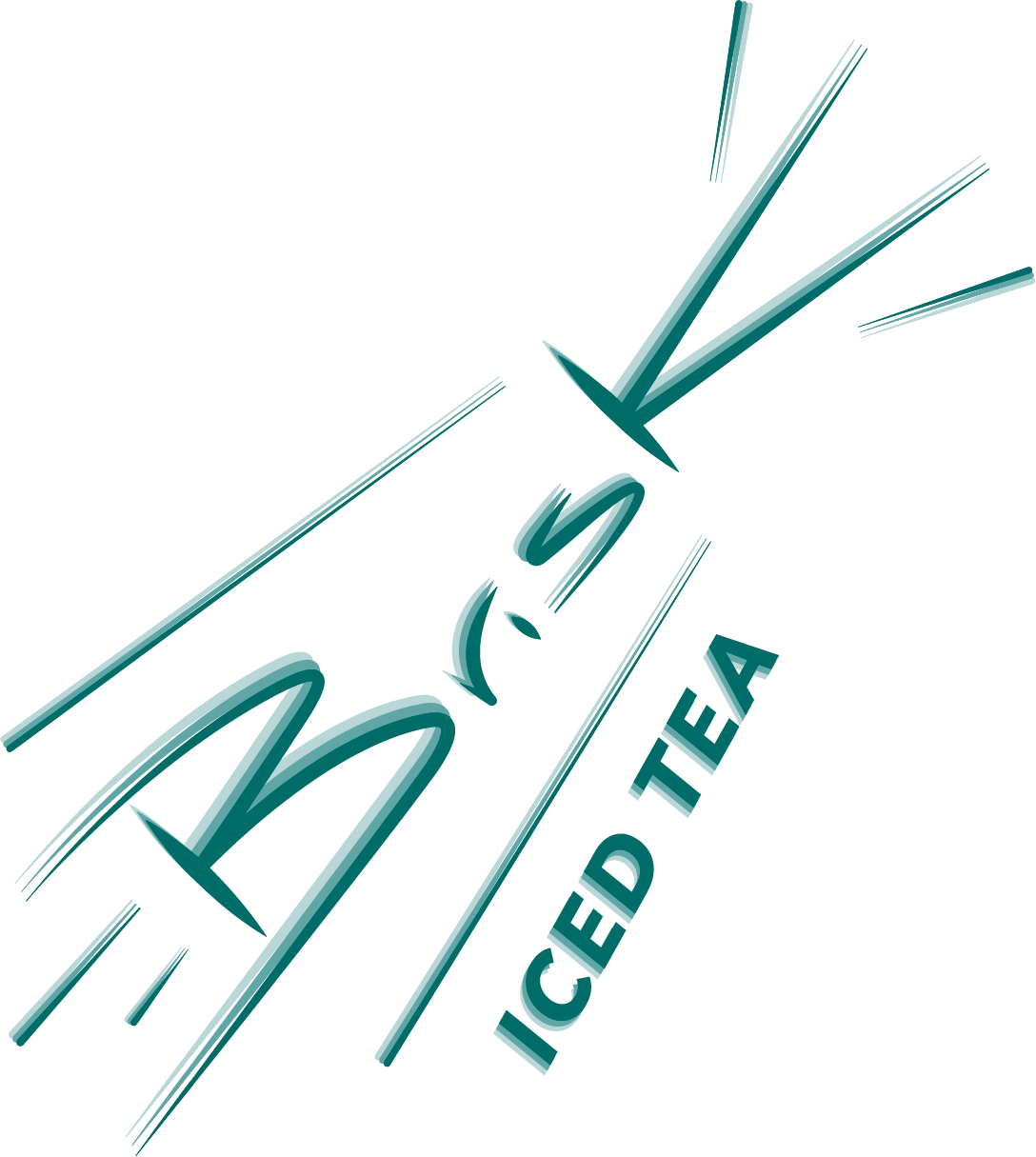
The design process for the logotype was centered around the idea that it should represent the definition of Brisk as well as adding movement. The concept was inspired by outer space warp speed and vanishing points elements which is evident in the use of thick and thin lines. The use of black on the bottle designs is a play on seeing a shooting star zoom by across a dark sky.
Pantone 329 C 100% - Dominant Color
Pantone 329 C 50% - Subordinate Color
Pantone 329 C 20% - Accent Color
"With a burst of energy, Brisk's logo travels at warp speed with its icy new look."


A four pack carrier for the Peach Mango tea.